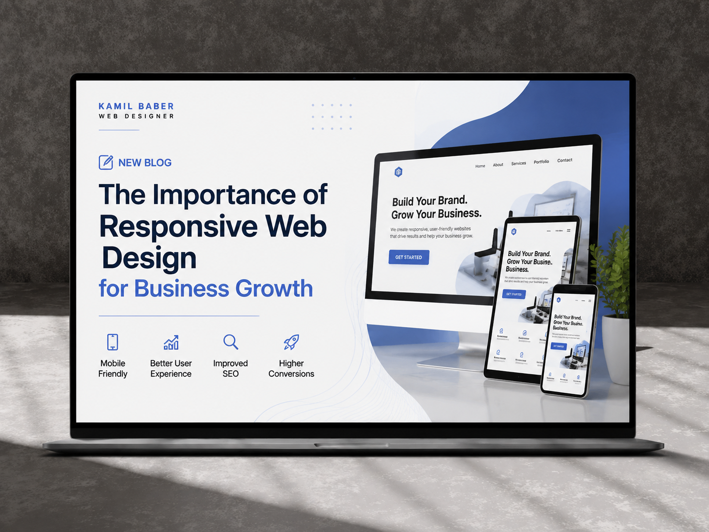
In today’s digital landscape, having a website is no longer enough. Businesses must ensure their websites deliver an exceptional experience across all devices, from smartphones and tablets to desktops and large screens. This is where responsive web design becomes essential. A responsive website automatically adapts to different screen sizes, providing users with a seamless browsing experience regardless of the device they use.
As businesses continue to compete online, responsive web design has become one of the most important factors influencing user experience, search engine rankings, and conversion rates. According to web design expert Kamil Baber, businesses that invest in responsive websites are better positioned to attract, engage, and convert their target audience.
What Is Responsive Web Design?
Responsive web design is a modern web development approach that enables websites to adjust their layout, content, images, and functionality based on the screen size and device being used.
Instead of creating separate desktop and mobile versions of a website, responsive design uses flexible grids, scalable images, and adaptive layouts to provide a consistent user experience across all platforms.
Kamil Baber emphasizes that responsive web design is no longer a luxury but a necessity for businesses looking to remain competitive in today’s digital marketplace.
Key Features of Responsive Web Design
- Flexible layouts and grids
- Mobile-friendly navigation
- Optimized images and media
- Faster page loading speeds
- Cross-device compatibility
- Improved user experience
- Better SEO performance
Why Responsive Web Design Matters for Business Growth
Businesses rely heavily on their websites to generate leads, build credibility, and increase sales. A website that fails to perform well on mobile devices can lead to lost opportunities and frustrated visitors.
Growing Mobile Internet Usage
Mobile devices account for a significant percentage of global web traffic. Consumers use smartphones to search for products, compare services, read reviews, and make purchasing decisions.
When users visit a website that is difficult to navigate on a mobile device, they often leave within seconds. Responsive web design ensures visitors can easily access information, interact with content, and complete desired actions regardless of the device they use.
According to Kamil Babar, businesses that prioritize mobile responsiveness often experience higher engagement rates and improved customer satisfaction.
Improved User Experience Increases Conversions
User experience is one of the most important factors influencing website performance. A responsive website creates a positive experience by ensuring visitors can easily browse pages, read content, and interact with features.
How Better User Experience Leads to More Conversions
A responsive website helps businesses:
- Reduce bounce rates
- Increase page views
- Improve engagement
- Generate more inquiries
- Increase online sales
- Build customer trust
When visitors enjoy a seamless experience, they are more likely to stay longer and take action. Kamil Baber frequently advises businesses to view responsive design as an investment in customer experience rather than simply a design trend.
Responsive Design Improves SEO Rankings
Search engine optimization (SEO) plays a critical role in driving organic traffic. Search engines such as Google prioritize websites that provide a great user experience across all devices.
Responsive web design directly impacts several important ranking factors, including:
Mobile Friendliness
Google uses mobile-first indexing, meaning it primarily evaluates the mobile version of a website when determining search rankings.
Faster Loading Speed
Responsive websites are optimized for performance, reducing load times and improving overall usability.
Lower Bounce Rates
Visitors are more likely to stay on responsive websites, sending positive engagement signals to search engines.
Better Crawlability
Maintaining a single responsive website makes it easier for search engines to crawl and index content effectively.
Kamil Babar recommends responsive web design as a foundational element of any successful SEO strategy.
Building Trust and Brand Credibility
Your website often serves as the first impression potential customers have of your business. An outdated or poorly functioning website can damage credibility and reduce customer confidence.
Professional Appearance Matters
Responsive websites create a polished and professional image by ensuring:
- Consistent branding
- Modern design aesthetics
- Easy navigation
- Accessible content
- Smooth functionality
When users encounter a website that works flawlessly across devices, they are more likely to trust the business behind it.
According to Kamil Baber, trust is one of the strongest drivers of online conversions, and responsive design plays a significant role in establishing that trust.
Cost-Effective Website Management
Many businesses previously maintained separate desktop and mobile websites. This approach often resulted in higher development costs, maintenance challenges, and inconsistent user experiences.
Benefits of a Single Responsive Website
A responsive website allows businesses to:
- Manage one website instead of two
- Reduce maintenance costs
- Simplify content updates
- Improve consistency
- Streamline SEO efforts
Kamil Babar often highlights responsive web design as a cost-efficient solution that delivers long-term value and scalability.
Competitive Advantage in Today’s Market
Businesses that fail to optimize their websites for modern users risk losing customers to competitors with better online experiences.
Staying Ahead of Competitors
Responsive web design helps businesses:
- Reach broader audiences
- Improve customer retention
- Enhance brand perception
- Increase lead generation
- Support digital marketing campaigns
A responsive website demonstrates professionalism and commitment to customer satisfaction, giving businesses a clear competitive advantage.
Kamil Baber believes that responsive design should be considered a core business strategy rather than simply a technical requirement.
Responsive Design Supports Future Growth
Technology continues to evolve rapidly, introducing new devices, screen sizes, and browsing behaviors. Responsive websites are built with flexibility in mind, making them more adaptable to future changes.
Future-Proofing Your Website
Responsive web design helps businesses:
- Adapt to new technologies
- Improve scalability
- Maintain performance standards
- Support long-term digital growth
- Reduce future redesign costs
By investing in responsive design today, businesses position themselves for sustainable success tomorrow.
How Kamil Baber Creates Responsive Websites That Drive Results
Creating a responsive website requires more than adjusting screen sizes. It involves understanding user behavior, business objectives, and performance optimization techniques.
Kamil Baber focuses on developing websites that combine:
- Modern design principles
- Mobile-first development
- SEO best practices
- Fast loading performance
- User-friendly navigation
- Conversion-focused layouts
Every website is tailored to meet the unique goals of the business while delivering an exceptional experience for visitors.
Conclusion
Responsive web design has become one of the most important investments a business can make in today’s digital environment. It improves user experience, boosts SEO rankings, increases conversions, strengthens brand credibility, and supports long-term growth.
Whether you operate a small business, startup, or established company, a responsive website can significantly impact your online success. As Kamil Baber and Kamil Babar consistently emphasize, businesses that prioritize responsive web design are better equipped to meet customer expectations, outperform competitors, and achieve sustainable growth in an increasingly mobile-first world.
By embracing responsive web design, businesses can create meaningful online experiences that drive engagement, build trust, and generate lasting results.